How Do Instagram Stories Ads Compare to Feed Ads?
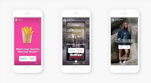
Instagram has two kinds of ads you’ll typically see. One is the traditional promoted post, a feed ad that looks just like a normal post with a sponsored label attached. The other is the Story ad, a specialized ad format based on the Instagram Story. Stories, in case you don’t know, are a format for collages of images and videos designed to last for a single day before they disappear forever.
Technical Specifications
So how do Feed ads and Story ads compare? First up, let’s talk about their technical specifications. These are the actual mechanics of what you can do with the ads, how they display, and how they act.
Feed ads can be images or videos. Facebook/Instagram recommends uploading the highest resolution source image or video you can. For video, they recommend H.264 encoding, progressive scan, stereo AAC audio at 128+ kbps, and a fixed framerate. Videos can be a maximum of 4GB in size, up to 120 seconds long, and a minimum of 1 second long.
Images for Feed ads should be JPG or PNG format. The minimum aspect ratio is 400×500, while the maximum is 191×100. Feed ads also support carousel format ads with anywhere from 2-10 cards that can include either images or video. Additionally, they support collection ads.
Instagram Feed Ad Video Guidelines
Instagram Feed Ad Image Guidelines
Instagram Feed Ad Carousel Guidelines
Instagram Feed Ad Collection Guidelines
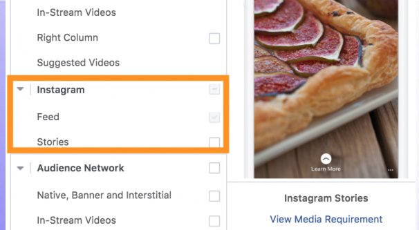
Story ads take the form of Instagram stories. The collection format is not supported here, but the other three are.
For video ads, videos are vertical and full screen. Videos typically play for the first 15 seconds, and users can tap to view a full 60 seconds. Again, the video file size is a maximum of 4GB, but videos can only be up to 60 seconds in length instead of 120.
Story ads with the image format can include multiple images, which progress through a slideshow one pane every five seconds, or until the user swipes through it. Carousels operate in a similar way.
Carousels also come in two formats. Native Story carousels can have 2-3 cards on them, while Expandable Story carousels can have 2-10 cards. The user must take action to see all 10.
Instagram Story Ad Video Guidelines
Instagram Story Ad Image Guidelines
Instagram Story Ad Carousel Guidelines
To compare them in more plain English, Story ads take up the full screen of a mobile device, formatted vertically. They can include both images and videos, and are sort of like carousels or slideshow videos even in limited formats.
Stories are also limited to 24 hours of distribution, without using a replay feature. They cannot get engagement, but they can direct users through to your website.
Meanwhile, feed ads are much more like standard posts. You can engage with them, you can comment on them, and they have all of the surrounding trappings of a typical Instagram post. The only difference is the call to action and the Sponsored label.
The First Experiment
I’m going to look at two experiments today, performed by different companies. The first is from AgoraPulse. Read along here.
The hypothesis that AgoraPulse puts forth to test is that there will be no difference between feed ads and story ads when it comes to driving traffic to a product, assuming that product caters to all age groups.
The product they chose to advertise was a podcast, though they ran into issues with tracking where the podcast conversions came from. They got around this with Apple’s analytics platform, which worked enough for their needs.
The ads they set up used the traffic objective, because they can’t use the tracking pixel to track conversions, and because their goal was to test comparative traffic. They go into detail with their naming conventions and their definitions, if you’re interested. I won’t be referencing them.
Their budget was $20 per day for their ads, run until they achieved a statistically significant result. This is important for any split test, and it’s a huge piece of advice every advertiser should know. You need to gather an appropriate, relevant amount of data when testing different ads and their variations. If you dump $100 into one ad and $10 into each of three variations, you’re not getting comparable results. All data must be statistically significant.
For targeting, they used a lookalike audience with an exclusion for those who had used their app or visited their website in the previous month. They also narrowed down their age range to the still-broad 28-64, since the extreme ends of either side are unlikely to be their customers.
The ads they created used nearly identical ad copy, with a bright image of a cartoon with some basic text over it. The feed ad had additional call to action text below, while the Story ad is larger and more immersive.
How did they compare with the results?
- Their feed ad spent $314 and reach 18,000 people. It generated 592 unique link clicks.
- Their story ad spent $310 and reached 26,700 people. It generated 1,039 unique link clicks.
Stories, thus, reached a larger number of users in their target audience, for a lower cost per unique link click. In fact, stories reached 44% more users with a nearly identical – and slightly lower – ad spend. Plus, their conversion rate was 23% higher with story ads than with feed ads.
Conclusions: it’s more expensive to run feed ads than it is to run story ads – at least with a broadly targeted audience – and story ads have higher visibility, higher clicks, and higher conversions.
Now the question is, does the second experiment come to similar conclusions?
The Second Experiment
The second experiment was performed by AdEspresso, experts in Facebook advertising. They know their way around the Facebook ad system, and they had $1,000 to spend on this experiment. You can read along here.
Unlike the first experiment, the second one makes use of video content for both their feed and story ads. They got their video from Combocut, an agency in Milan. They show the video in the experiment post I linked. Also unlike the first experiment, the videos they used were somewhat different for each format, rather than being the same video with a different crop. They have the same information, the same style, and the same graphics, but the story ad takes advantage of the taller vertical format to give a slightly different presentation for the imagery. In the end, they’re similar enough that it shouldn’t be a big deal, though.
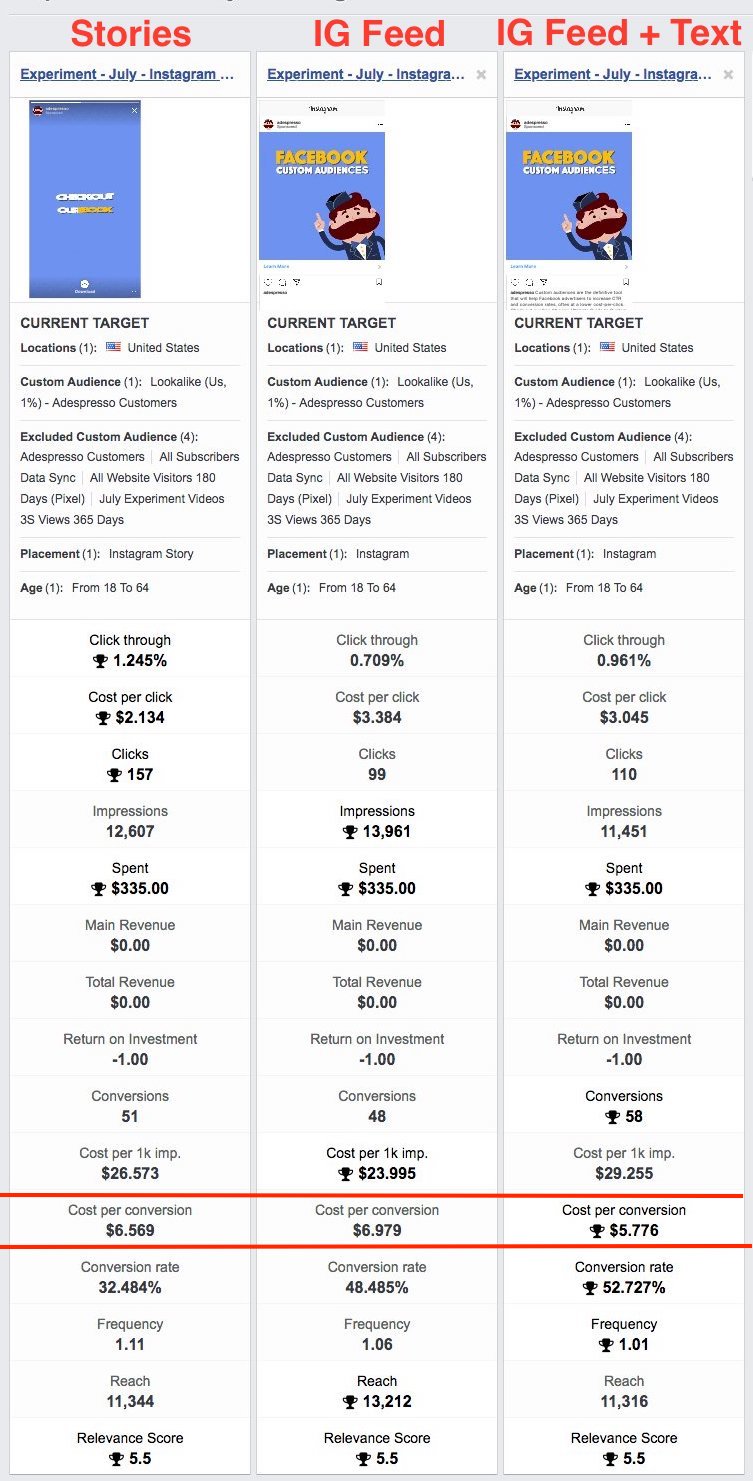
Since feed ads can have text and story ads cannot, AdEspresso decided to test three ads; a story ad, a feed ad with no caption, and a feed ad with a caption. This helps show the variance between all three situations.
Similar to the first experiment, they chose a lookalike audience with excluded website visitors and current customers. The goal of the ads was the same; to get users to click through to their landing page. In this case, they are promoting an ebook rather than a podcast.
The AdEspresso hypothesis was a little different. They expected stories to perform poorly, while feed ads would work better for their B2B product. The results?
- The Story ad had a 1.245% click through rate, a cost per click of $2.13, and a total of 157 clicks. This resulted in 51 conversions and a cost per conversion of $6.56.
- The feed ad without text had a 0.709% click through rate and a cost per click of $3.38. They totaled 99 clicks, 48 conversions, and a cost per conversion of $6.97.
- The feed ad with text had a 0.961% click through rate, a cost per click of $3.04, and a total of 110 clicks. This resulted in 58 conversions and a cost per conversion of $5.77.
All three ads had a total ad spend of $335 each.
Conclusions: The feed ad with text had the lowest cost per lead for AdEspresso, since it had the highest conversion rate. The story ad had the best click-through rate, though, and the best cost per click. All of them were quite similar, though.
Meanwhile, when comparing just the feed ads with and without text, the ad with text performed better. The only area where the ad without text excelled was in impressions and cost per thousand impressions. It had the best reach, but didn’t utilize that reach as much as possible.
Here, feed ads get better raw traffic, but story ads get more qualified leads. This doesn’t contradict what AgoraPulse found with their experiment.
Final Thoughts
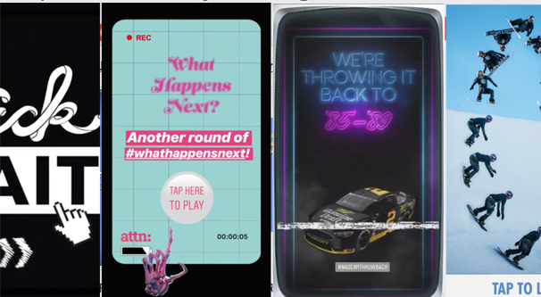
So what conclusions can we draw from this? Well, for one thing, Story ads are not going away. In fact, Instagram keeps adding additional features and additional benefits to using stories over the standard feed. Stories have larger, more immersive presentation, and they are better able to make use of that presentation.
At this point, if you’re not actively testing story ads and you want to be an Instagram marketer, you have a lot of catch-up to do. You need to be experimenting with the format and using it for your advertising if you want to succeed on Instagram. All of the most engaged users – on the platform, anyways – are using stories.
So how do you make the most out of Instagram story ads?
- Remember that Story ads can have videos, images, or a mixture of both. Videos tend to do the best, but mixing in photos can be a great way to add more information without the need to animate it.
- Either produce an extremely high quality video, or hire a company to do one for you. Stories work best with videos, and videos work best when they’re well made. If you don’t have the tools or facilities to produce videos, there’s no shame in outsourcing them.
- Make sure to tell a story with your video. Start with something that hooks a viewer, preferably by asking them about a problem you know they have. Follow up with the value proposition of solving their problem, and finish up with your solution.
- Keep your messaging short. The more you’re forcing users to read, absorb, or think about when you’re showing them your ad, the less likely they will be to do that reading or thinking. A simple message that can come across before the user swipes away is best.
- Don’t forget your branding! AdEspresso’s experiment videos are great because they have their very recognizable mascot character in the video from start to finish. Sometimes a logo is all you need; users might not remember the contents of the story, but they’ll remember you. This is triply true if you’re running ads that focus on brand awareness rather than ads for conversions.
- Make sure you have a strong call to action. Your goal with a story ad is to get users to swipe up for more information. You can call attention to this in a number of different ways, from arrows to captions, so play around with different ways to draw user focus to the swipe.
- Remember the text rules! Facebook still has their 20% text rules, even if they’re no longer regulated by a dumb grid, and this applies to Instagram too. Too much text in your ads will reduce their distribution.
What about you? Do you have experience with story ads, and have you found them to work better than feed ads? Tell me your story below.


